Blended CPI
Learn what the Blended CPI chart measures and when to use it.
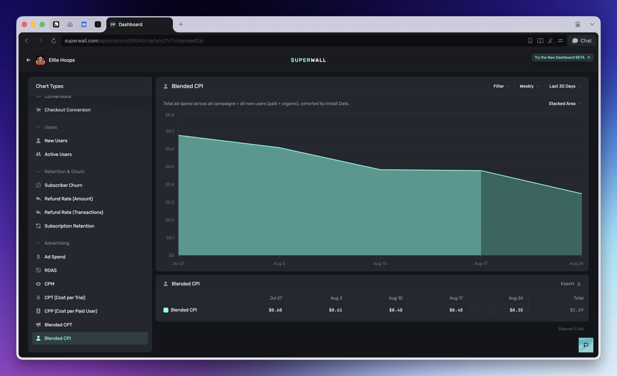
What it shows
Blended CPI shows your total ad spend across all campaigns divided by all new users, paid and organic.
How to use it
Use it to see what an install costs you overall, counting the organic installs that paid acquisition may also be driving.
Good to know
Blended CPI divides by installs, which web platforms don't report, so treat it as mobile-only. Stripe apps never see it. Paddle, promotional, and web checkout apps may still list it in the chart picker, where it has nothing meaningful to divide by.
Blended CPI is a single blended figure and intentionally has no breakdown. For cost per install per campaign, use the acquisition cohort report, which divides spend by MMP-matched installs instead of by every install.
Because values are cohorted by install date, the chart never uses an interval finer than a week while the interval is set to auto. A long enough range still resolves to monthly, and picking an interval yourself overrides it.
Advertising charts appear once performance marketing is enabled for your app. See Meta Ads.
How is this guide?